Colours that will impact our colour choices this Autumn
The first of September heralds the start of meteorological Autumn, when we say goodbye to the summer, and welcome cosy, shorter days, and pack away those shorts, swimsuits, and sleeveless tops for another year.
One of the ways we make the transition between the seasons is how we perceive light and colour. The light in Autumn, is warm and soft carrying the last vestiges of summer to ripen the blackberries. It has a mellow, earthy quality we notice the yellow undertones around us in the changing of the leaves, and the glut of windfalls, pumpkins, the foxes and pheasants. Retailer certainly change the colours available in store, favouring more neutral tones, with pops of rich red, greens and metallic nearer Christmas for festive sparkle.
There are four colour ways that are consistent through September till the end of December every year. Excellent news as there is something for everyone’s preference.
Four colour ways
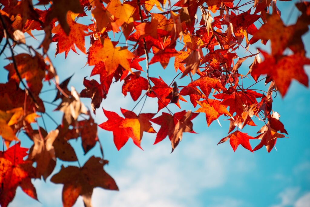
Warm, yellow based, earth tones
Bronze, brown, amber, and rust are matched with oyster, teal, gold, orange, and mustard to create a sumptuous, luxe feel. Textured, soft fabrics such as velvet, wool, and thick jerseys echo the feeling of opulence. This palette is often used in branding to signify quality and a timeless elegance. Not a coincidence that Harrods continue to use olive and bronze, and Cadbury, Royal purple, and gold.
Warm, yellow based clear and bright
This palette differs from the previous one in that the colours have a clear and bright quality. There is nothing dusky or soft about these colours. Chocolate, tan, cinnamon, caramel and honey are balanced with cream, banana yellow, salmon and shocking pink. A beautiful, sweet concoction of food named colours that have a lively fresh feel. People who favour these colours often have lively, youthful natures.
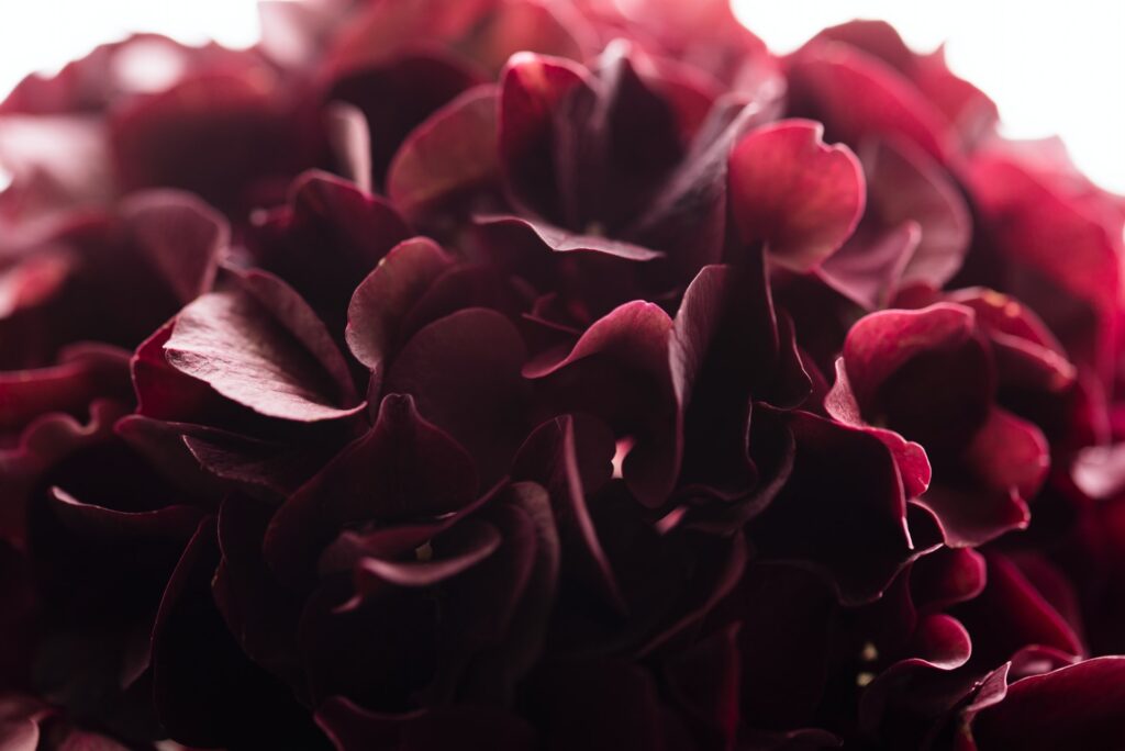
Cool, blue based, soft, and smoky
A sophisticated, elegant palette this another colourway that has a chic, classic feel. Smokey grape, damson, plum and raspberry, sit comfortably with ivory, air force blue, petrol, bluey grey, sea green and silver. Powder pink and cherry adds a pop of colour.
Cool, blue based, clear, and vivid
These regal, icy and jewel-like colours come into their own around the festive period. Burgundy, black, charcoal, and inky indigo contrast beautifully with optic white, cobalt, silver, carmine red, scarlet, deepest pine green and emerald, royal purple, and my personal favourite; fuchsia.
In this palette are the Pantone Colour for 2021, which was unusually two colours: Illuminating Yellow and Ultimate Grey.
This acid yellow was chosen to symbolise the confidence and enthusiasm we would need this year, balanced with steady, resilient grey. If you’re a fan, this probably the last opportunity to purchase these colours which have been abundant in clothing, paint colours, car, and textiles.
Colour has the power to energise, calm, excite, signal authority or quality. Think carefully about the colour families above and you won’t go far wrong in co ordinating the Autumn months ahead.
Author: Linda Sujeewon House of Colour Reading. Image Consultant.
Mobile: O7717 010128
linda.sujeewon@houseofcolour.co.uk
Follow Linda at houseocolourreading on Instagram or LinkedIn of LindaHoCReading on Facebook.